B2B Website for Urban Circus
Reimagine company's presentation strategies and information structure
As the sole Product Designer, I owned the full design lifecycle of the website—conducting user research, crafting UX/UI solutions, and collaborating with strategy and marketing teams to align design with business goals and user needs.
Product type
Website
Role
Product Designer
Industry
Flash Tech
Stage of project
Check Website
PROBLEM
xxx
Urban Circus platform users struggled to complete purchases due to outdated navigation and an inconsistent information architecture. Key features - such as filtering and access to the size chart - were hard to locate. The interface felt cluttered and confusing.
Customer reviews and support tickets revealed frustration over incomplete product information, which often led to purchasing items in the wrong size. Google Console data showed an increase in abandoned carts and a decline in returning users.
Issues with navigation and content presentation directly impacted conversion rates, customer loyalty, and brand trust. These challenges became the starting point for the platform’s redesign.
PROJECT GOAL
User's goals
Better navigation and faster purchasing process
Clear, modern presentation of offerings and competitive advantages
Buissnes’s goals
Increase the number of B2B partnership inquiries
Strengthen the image of a modern, professional brand
ANALYSIS AND RESEARCH
Identifying the Friction:
UX & UI Audit of the Existing Platform
In this project, the goal was to build a common, understandable view of the user for everyone - their needs, motivations, contact with the company and cooperation. Through qualitative research and creation of personas, we managed not only to organize knowledge about users, but above all to engage the team in creating solutions that are truly human-oriented.

Uwagi
Aulepszenia
uporządkować
PROBLEM - SOLUTION
Shaping a Clearer Path:
Aligning Business Goals with User Journeys
While conducting benchmarking, creating mind maps, and analyzing user journeys, I identified three key action areas to help achieve our business goals:
PROJECT GOAL
Shortening the contact process — by offering multiple touchpoints where users can easily initiate contact with the company.
Simplifying navigation — ensuring quick, intuitive access to essential information and services.
Unifying visual identity — aligning it with a better-known sister brand to strengthen credibility and brand recognition.

🔧 Objective:
My priority was to streamline communication and optimize the contact path - to make the process as simple as possible for users already determined to use the services.
✅ Solution:
Visible CTAs in key places
Sticky popup WhatsApp
🔧 Objective:
Unifying the visual identity — adapting it to a better-known sister brand in order to strengthen the brand's credibility and recognition.
✅ Solution:
Consistent visual storytelling on the website Visual testing with users
🔧 Problem:
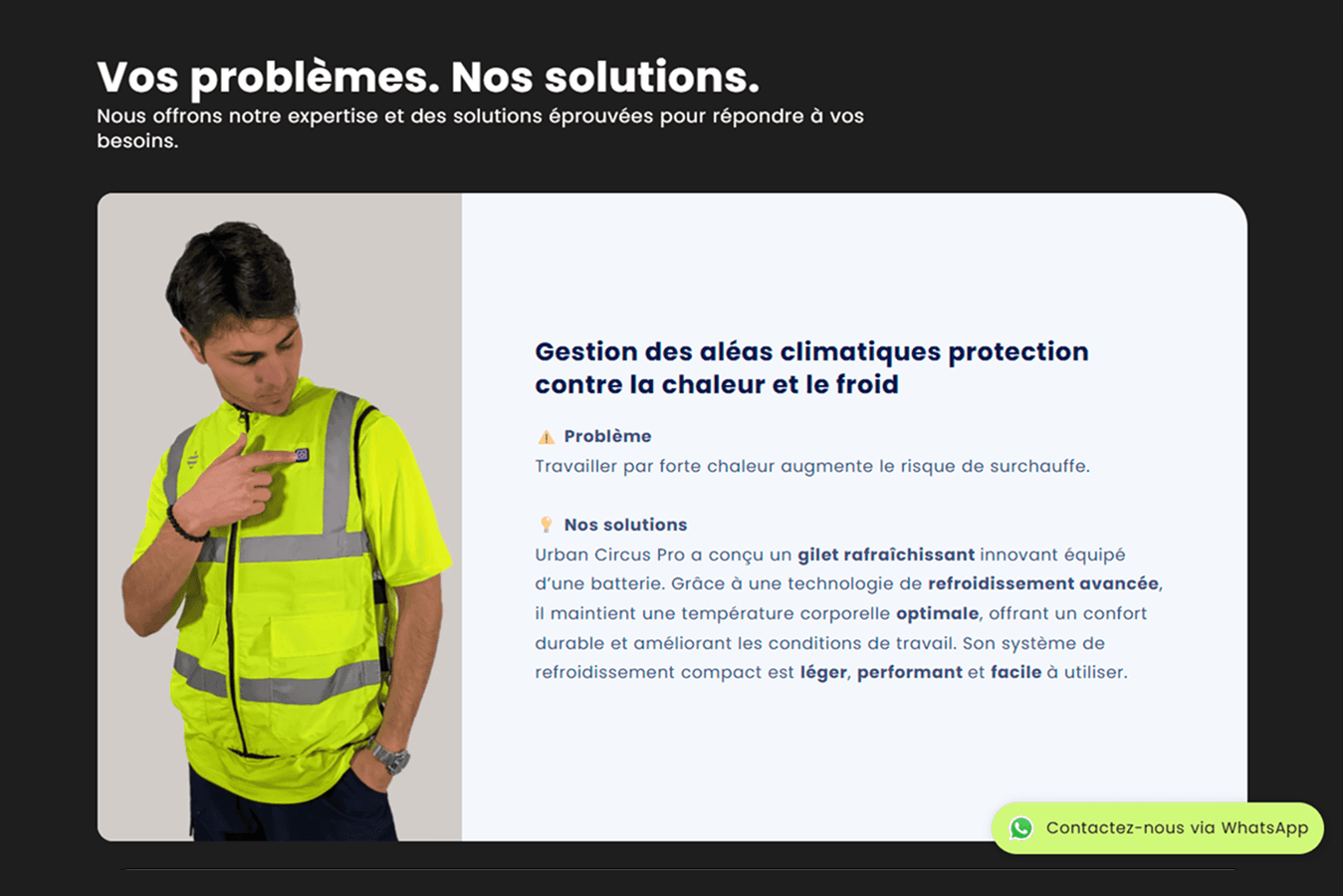
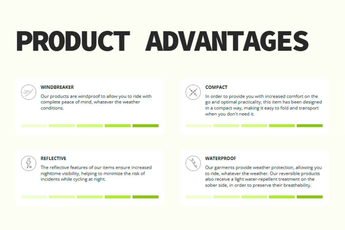
Customers didn't understand technical names and category designations like 'Breathability 30,000 g/m2/24h MVTR.'
✅ Solution:
I've added short descriptions with icons and scale for each specification to the technical details.

🔧 Problem:
On the category page, some of the product names contained the word “veste,” others “manteau,” even though visually they looked similar.
✅ Solution:
I standardized the naming - all lightweight jackets are labeled “vestes” with the corresponding “mi-saison” filter.
USER TESTS
Testing the Prototype with Users: Validating Design Decisions and Defining the Next Steps
I followed an iterative testing process, conducting multiple rounds of user testing to gather feedback, implement changes, and test again. This continuous cycle of test, refine, validate ensured the final design aligned with user needs and business goals.
Stage of project
User test
Time
30 min -1h each
Number of participants
15 (24-68 years)
Place
On site/online
Uwagi
Aulepszenia
uporządkować
RESULTS
Key Insights
Na podstawie informacji zwrotnej od użytkowników podczas testów oraz analizy ich zachowań w trakcie korzystania z witryny, wprowadzono zmiany, które znacząco poprawiły doświadczenie użytkowników.
zdjecie
❌ We decided to remove this blocking feature for the V2, as it was causing confusion and frustation among users
final solution
Building a Unified Understanding: Centering the Business on User Needs
I regularly analyzed key metrics - conversions, task completion time and engagement - comparing them to recent UX and marketing changes. I used quantitative data and user feedback to understand both the effects and the reasons behind the changes, allowing for continuous improvements.
CSM/HTML
Connect your site to the most popular apps out there.
SEO.aCCESIBILITY
Add effects with a few clicks and capture your audience’s attention when they land on your website.
Plans for later
Usprawnienie sciezki uzytkownika:
Potrzeby uzytkownika wzrost
In this phase, we used AI tools to simulate user interactions and analyze usability issues at scale. This approach allowed us to gather fast, actionable insights without the need for traditional in-person testing.

zBUDOWANIE SKLEPU
Wedlug rekomendacji Baymand Institute strona e-commerce powinna zawierac okm,.45% asortymentu na HP, uc ZAWIERA tylko jedna karuzele, reszta to zbedne informacje , ktore nie powinny byc na Home Page a zabieraja wazna przestrzen. Calosc jest tez zbyt zwarta bez bialych przestrzeni
Plans for later
Dlaczego zrobilam to tak a nie inaczej i jak bym to zrobila lepiej
budzet, mala firma, brak kadry, marketing, czas