
Renting application
Renting application
A mobile application designed to enable blue-collar workers to practice anywhere.
A mobile application designed to enable blue-collar workers to practice anywhere.
CoSpaceBuddy is a mobile application designed to allow blue-collar workers to practice anywhere in the world. In this project, I used research data to create a product that increases business development opportunities for people on a low budget.
Product type
Application
Role
UX Designer
Industry
Knowledge Sharing
Stage of project
No link available
I designed and implemented comprehensive UX/UI solutions for the Urban Circus shopping platform, including a redesign of the information architecture, purchase flow, and responsive interface.
CoSpaceBuddy is a mobile application designed to allow blue-collar workers to practice anywhere in the world. In this project, I used research data to create a product that increases business development opportunities for people on a low budget.
CoSpaceBuddy is a mobile application designed to allow blue-collar workers to practice anywhere in the world. In this project, I used research data to create a product that increases business development opportunities for people on a low budget.
Product type
Product type
E-commerce
E-commerce
Role
Role
Product Designer
Product Designer
Industry
Industry
Flash Tech
Knowledge Sharing
Knowledge Sharing
UNDERSTANDING THE PROBLEM AND BUSINESS CONTEXT
UNDERSTANDING THE PROBLEM AND BUSINESS CONTEXT
'How to make the best use of your workspace?'
'How to make the best use of your workspace?'
Problem
Problem
After conducting interviews and brainstorming sessions, I discovered gaps in business development among manual workers such as tattoo artists and hairdressers.
After conducting interviews and brainstorming sessions, I discovered gaps in business development among manual workers such as tattoo artists and hairdressers.
Goals
Goals
My goal is to broaden the horizons of workers by facilitating compelling global collaborations.
My goal is to broaden the horizons of workers by facilitating compelling global collaborations.
DISCOVER
DEFINE
Exploring the User's Needs
User's Needs and Problems
At this stage, my aim was to define the overall theme of the project and gather valuable information to help inform future design decisions.
This phase involves an in-depth analysis of all available information to gain a comprehensive understanding of the product's users, identifying who they are, their needs and frustrations.
DISCOVER
Exploring the User's Needs
At this stage, my aim was to define the overall theme of the project and gather valuable information to help inform future design decisions.
Value proposition
Discover and book unique physical workspace. Our platform eliminates the need for long-term rental of costly premises. Grow your business and get clients wherever you are, while hosts earn additional income by sharing their spaces.
Competitive analysis
During the competitive analysis, I focused on a thorough understanding of the solutions offered by similar applications.
Value proposition
Discover and book unique physical workspace. Our platform eliminates the need for long-term rental of costly premises. Grow your business and get clients wherever you are, while hosts earn additional income by sharing their spaces.
Value proposition
Discover and book unique physical workspace. Our platform eliminates the need for long-term rental of costly premises. Grow your business and get clients wherever you are, while hosts earn additional income by sharing their spaces.
Competitive analysis
During the competitive analysis, I focused on a thorough understanding of the solutions offered by similar applications.
Competitive analysis
During the competitive analysis, I focused on a thorough understanding of the solutions offered by similar applications.
DEFINE
User's Needs and Problems
This phase involves an in-depth analysis of all available information to gain a comprehensive understanding of the product's users, identifying who they are, their needs and frustrations.
Value proposition
Discover and book unique physical workspace. Our platform eliminates the need for long-term rental of costly premises. Grow your business and get clients wherever you are, while hosts earn additional income by sharing their spaces.
Value proposition
Discover and book unique physical workspace. Our platform eliminates the need for long-term rental of costly premises. Grow your business and get clients wherever you are, while hosts earn additional income by sharing their spaces.
Competitive analysis
During the competitive analysis, I focused on a thorough understanding of the solutions offered by similar applications.
Competitive analysis
During the competitive analysis, I focused on a thorough understanding of the solutions offered by similar applications.
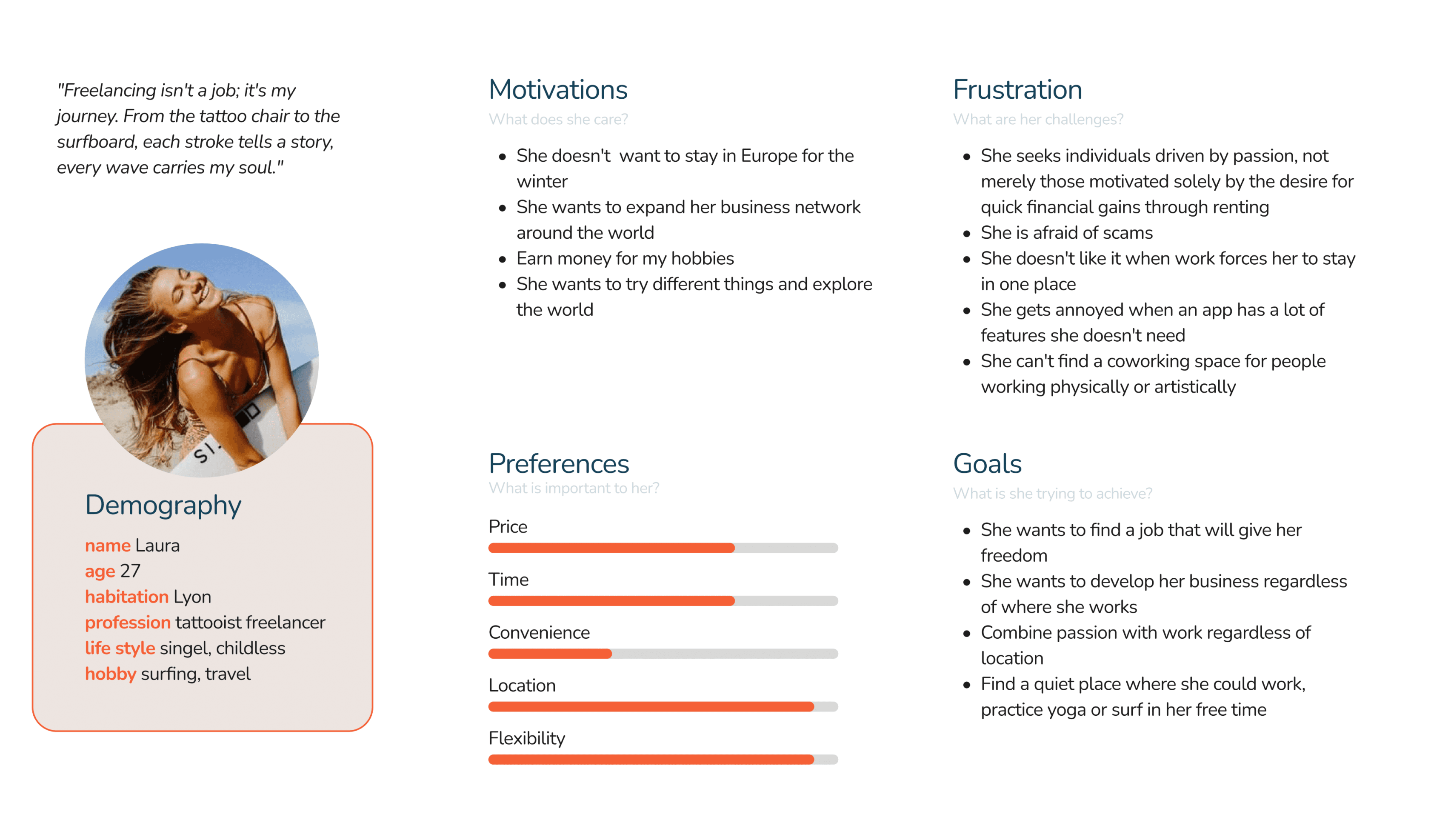
Protopersonas
I developed proto-personas to organize knowledge and assumptions about potential users, including their demographics, needs, goals, and pain points, aiding in the identification of key insights for the project.
Protopersonas
I developed proto-personas to organize knowledge and assumptions about potential users, including their demographics, needs, goals, and pain points, aiding in the identification of key insights for the project.
As a person with disabilities I want to spaces include information about accessibility for people with disabilities to didn't have to ask host.
As a person with disabilities I want to spaces include information about accessibility for people with disabilities to didn't have to ask host.
As a person with disabilities I want to spaces include information about accessibility for people with disabilities to didn't have to ask host.

As a always a busy person I want to quickly choose offers related to my profession to don't waste my time.
As a always a busy person I want to quickly choose offers related to my profession to don't waste my time.
As a always a busy person I want to quickly choose offers related to my profession to don't waste my time.
User stories
User stories
I then crafted user stories, clarifying the who, what, and why behind each activity, enabling me to identify key functions and their significance for the entire app.
I then crafted user stories, clarifying the who, what, and why behind each activity, enabling me to identify key functions and their significance for the entire app.
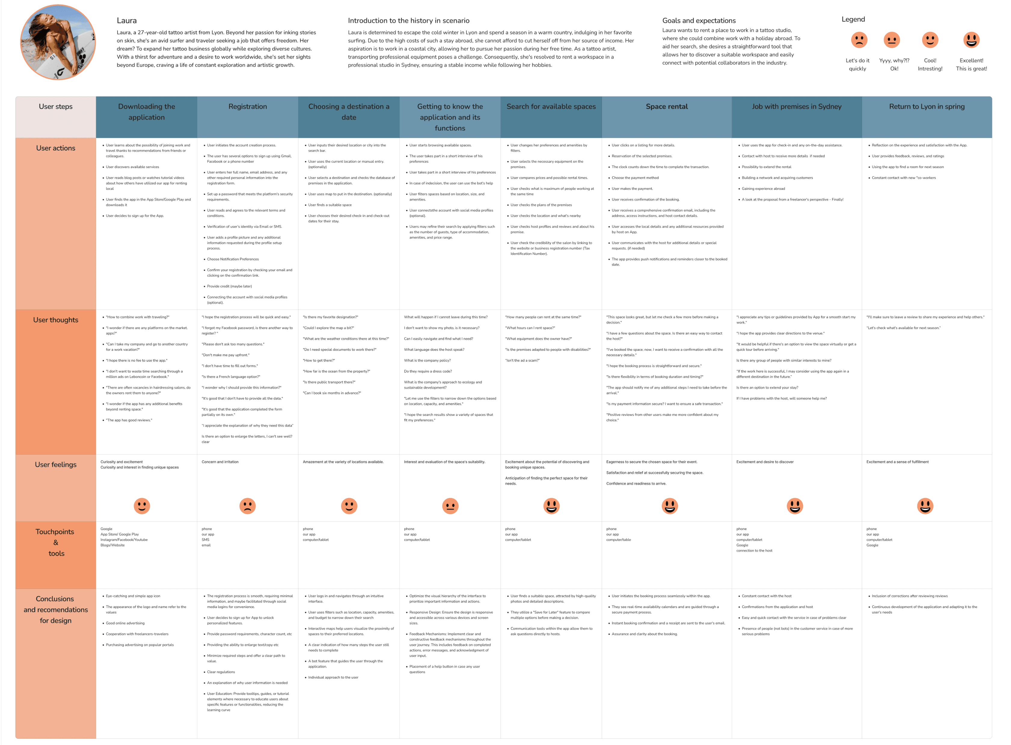
User Journey Map
User Journey Map
By crafting customer journey maps, I visualized users' real-life interactions with the app, enhancing my empathy and understanding across various stages of their experience.
By crafting customer journey maps, I visualized users' real-life interactions with the app, enhancing my empathy and understanding across various stages of their experience.
DEVELOP
DEVELOP
Creating the Framework
Creating the Framework
At this stage, all the information that must be included in the product and the paths the user will follow to achieve their goal were successfully mapped out.
At this stage, all the information that must be included in the product and the paths the user will follow to achieve their goal were successfully mapped out.
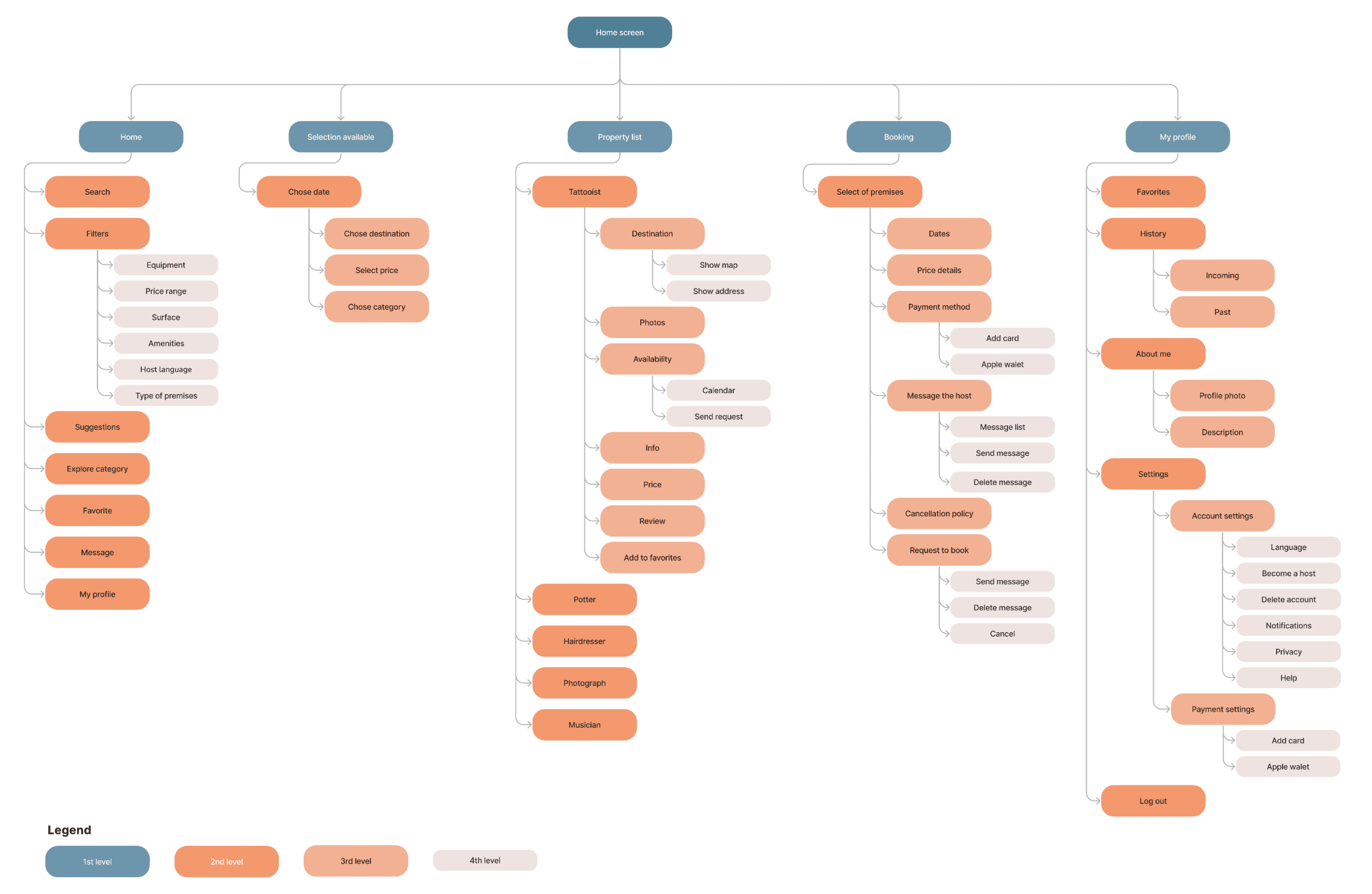
Information architecture
Information architecture
I developed the site map as a basis for navigation, providing easy access and a user-friendly structure for the information in the application.
I developed the site map as a basis for navigation, providing easy access and a user-friendly structure for the information in the application.
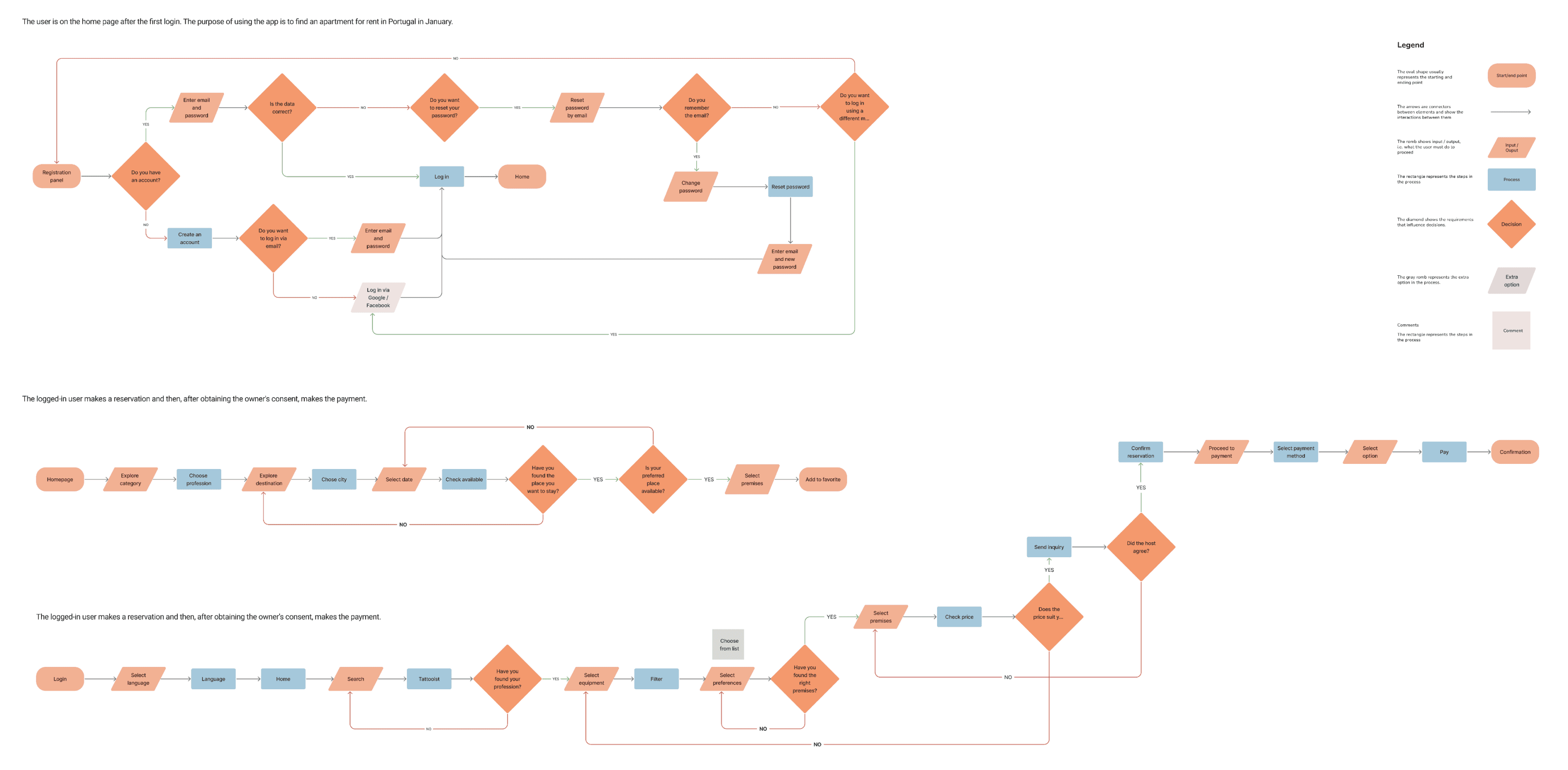
User Flow
User Flow
I created visual route maps illustrating user journeys for specific tasks, aiming to identify potential navigation obstacles.
I created visual route maps illustrating user journeys for specific tasks, aiming to identify potential navigation obstacles.


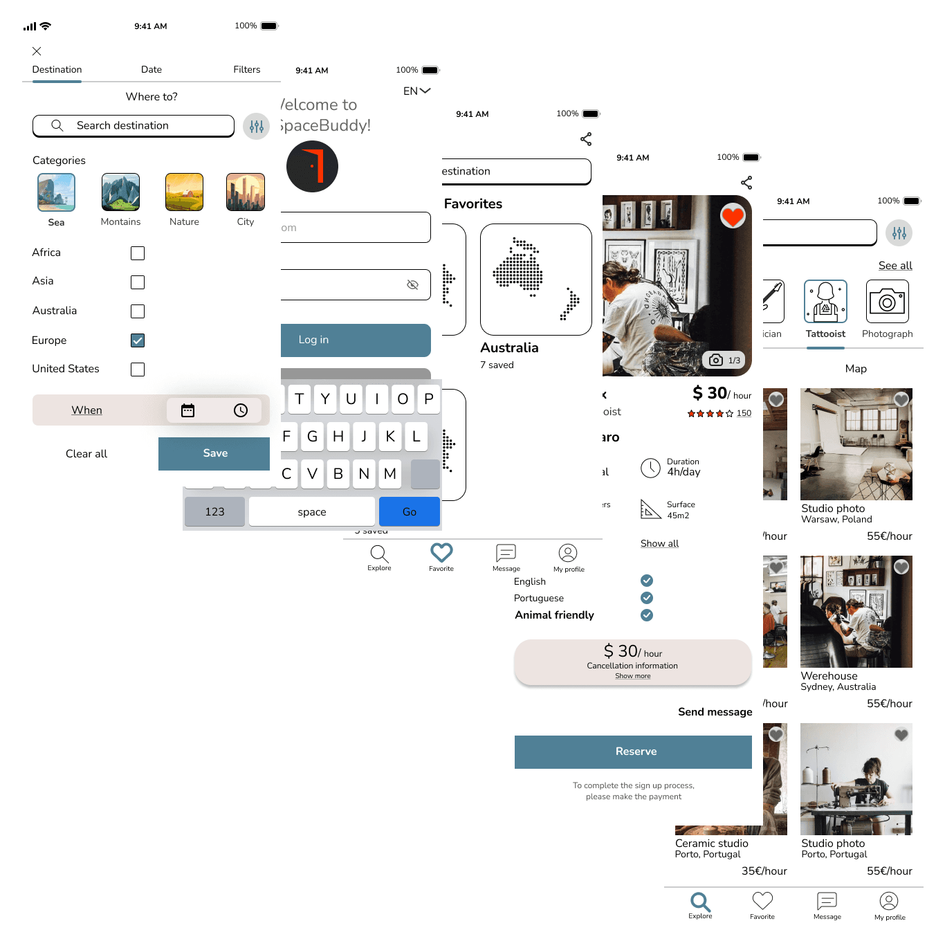
Wireframes
Wireframes
Utilizing the initial lo-fi wireframes, I conducted early usability tests to identify priority revisions for immediate implementation. This streamlined the iteration process for subsequent versions, focusing efforts on crafting the hi-fi interface.
Utilizing the initial lo-fi wireframes, I conducted early usability tests to identify priority revisions for immediate implementation. This streamlined the iteration process for subsequent versions, focusing efforts on crafting the hi-fi interface.
DELIVERY & TEST
DELIVERY & TEST
Let's make the Design
Let's make the Design
After finalizing all screens, I crafted a prototype to gather extensive feedback and assess the product's utility. The goal was to ensure it enables users to achieve their goals precisely, efficiently, and without unnecessary frustration.
After finalizing all screens, I crafted a prototype to gather extensive feedback and assess the product's utility. The goal was to ensure it enables users to achieve their goals precisely, efficiently, and without unnecessary frustration.
MODERATED TEST PROTOTYPE
MODERATED TEST PROTOTYPE
Duration
Duration
10-15 minutes
10-15 minutes
Research goal
Research goal
To test selecting categories from filters.
To test selecting categories from filters.
Task
Task
Test the process of adding a new tattoo studio to the ‘Favourites’ category. Later, review the application and see what it offers.
Test the process of adding a new tattoo studio to the ‘Favourites’ category. Later, review the application and see what it offers.
Participants
Participants
2 people looking for a professional tattoo studio for rent.
2 people looking for a professional tattoo studio for rent.
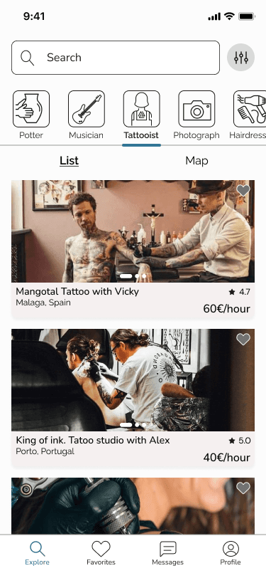
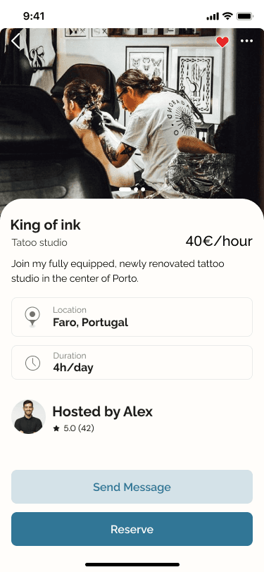
Wireframes & Prototype
Wireframes & Prototype
Based on lo-fi wireframes, I conducted early usability tests to quickly identify key issues and streamline iterations. Then, after refining all the screens, I created a hi-fi prototype to gather feedback and assess whether the product effectively supports users in achieving their goals.
Based on lo-fi wireframes, I conducted early usability tests to quickly identify key issues and streamline iterations. Then, after refining all the screens, I created a hi-fi prototype to gather feedback and assess whether the product effectively supports users in achieving their goals.
REDESIGN & IMPROVE SCREENS
REDESIGN & IMPROVE SCREENS
Putting knowledge into action
Putting knowledge into action
By continuously expanding my knowledge and gathering valuable feedback, I can catch mistakes and enhance my designs. After analyzing the results, I identified areas for improvement and began refining the project accordingly, making it more useful.
By continuously expanding my knowledge and gathering valuable feedback, I can catch mistakes and enhance my designs. After analyzing the results, I identified areas for improvement and began refining the project accordingly, making it more useful.
Layout
Longer texts in two columns are often problematic on small devices.
With a single-column layout, users can give longer titles to their services and find it easier to focus their eyes when viewing information.

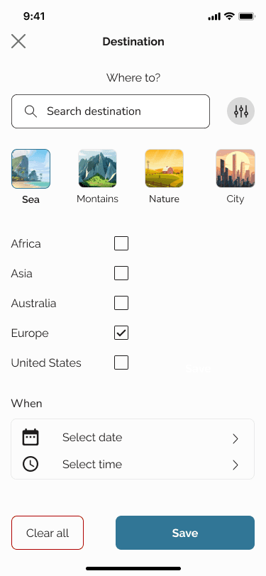
Hierarchy
Changing the hierarchy of information and adding labels helps users to scan lists quickly. Zooming in on a photo allows for better presentation, and the colours chosen have the right contrast (re: WCAG 2.2).
I have also relocated the ‘Send message’ button, changing its style while clearly indicating a lower position in relation to the main action.

Content
The careful composition of the grid intuitively directs the user's attention to key elements.
Both icons, graphics and images are kept in similar tones, thus maintaining uniformity and visual consistency.
Consistency
I removed the unnecessary "Welcome" message and replaced it with text explaining the app's function. I also centralized important information, focusing on user ergonomics and habits.
Additionally, I adjusted the button options and layout to better meet user needs.
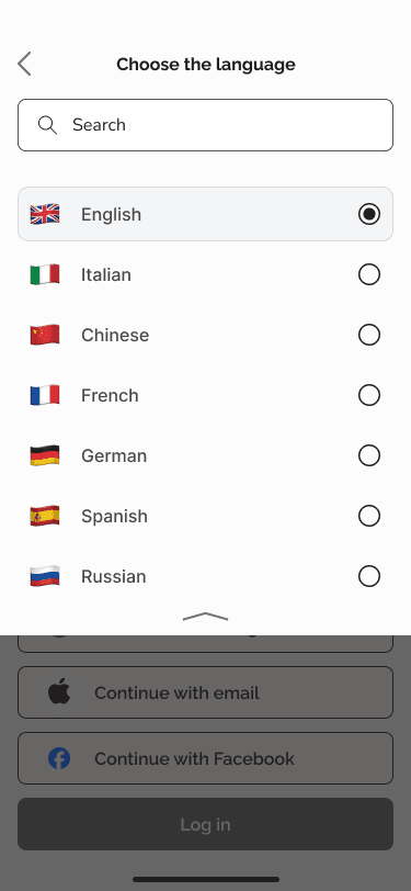
Icons
I standardized the line thickness and removed distracting elements like shadows and progress bars. I also unified the appearance of buttons for a more organized look.
The consistent placement of elements and their proportions make it easier for users to orient themselves on the site.

Facilitation
I added a search bar to expedite language selection and grayed out the white background for better readability.
Following industry standards, I relied on established user habits for naming and placing key elements, such as radio buttons that allow selecting only one option.
Transparency
The addition of light gray balances the white space, creating a harmonious and tranquil feel. This subtle treatment makes the screen even more pleasing to the eyes without sacrificing aesthetics and readability.
In the previous version of the screen, there is no option to return to the previous screen, so I have added a back button to improve navigation.

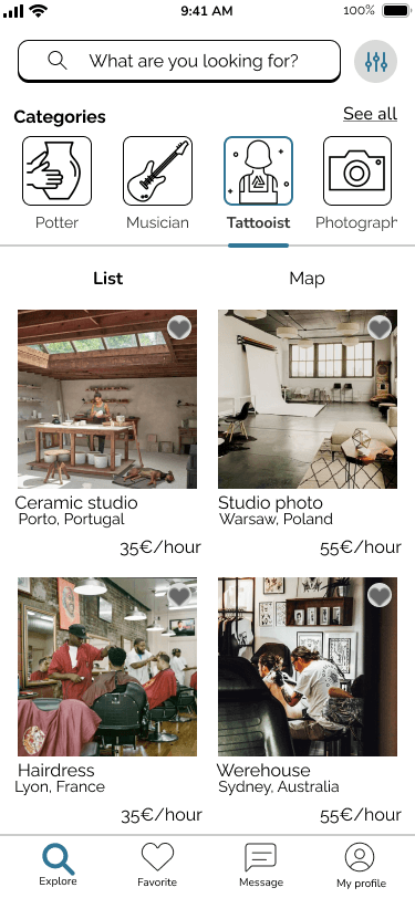
Layout
Longer texts in two columns are often problematic on small devices.
With a single-column layout, users can give longer titles to their services and find it easier to focus their eyes when viewing information.
Hierarchy
Changing the hierarchy of information and adding labels helps users to scan lists quickly. Zooming in on a photo allows for better presentation, and the colours chosen have the right contrast (re: WCAG 2.2).
I have also relocated the ‘Send message’ button, changing its style while clearly indicating a lower position in relation to the main action.
Content
The careful composition of the grid intuitively directs the user's attention to key elements.
Both icons, graphics and images are kept in similar tones, thus maintaining uniformity and visual consistency.
Consistency
I removed the unnecessary "Welcome" message and replaced it with text explaining the app's function. I also centralized important information, focusing on user ergonomics and habits.
Additionally, I adjusted the button options and layout to better meet user needs.
Icons
I standardized the line thickness and removed distracting elements like shadows and progress bars. I also unified the appearance of buttons for a more organized look.
The consistent placement of elements and their proportions make it easier for users to orient themselves on the site.
Facilitation
I added a search bar to expedite language selection and grayed out the white background for better readability.
Following industry standards, I relied on established user habits for naming and placing key elements, such as radio buttons that allow selecting only one option.
Transparency
The addition of light gray balances the white space, creating a harmonious and tranquil feel. This subtle treatment makes the screen even more pleasing to the eyes without sacrificing aesthetics and readability.
In the previous version of the screen, there is no option to return to the previous screen, so I have added a back button to improve navigation.
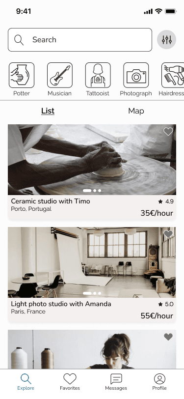
Layout
Longer texts in two columns are often problematic on small devices.
With a single-column layout, users can give longer titles to their services and find it easier to focus their eyes when viewing information.
Hierarchy
Changing the hierarchy of information and adding labels helps users to scan lists quickly. Zooming in on a photo allows for better presentation, and the colours chosen have the right contrast (re: WCAG 2.2).
I have also relocated the ‘Send message’ button, changing its style while clearly indicating a lower position in relation to the main action.
Content
The careful composition of the grid intuitively directs the user's attention to key elements.
Both icons, graphics and images are kept in similar tones, thus maintaining uniformity and visual consistency.
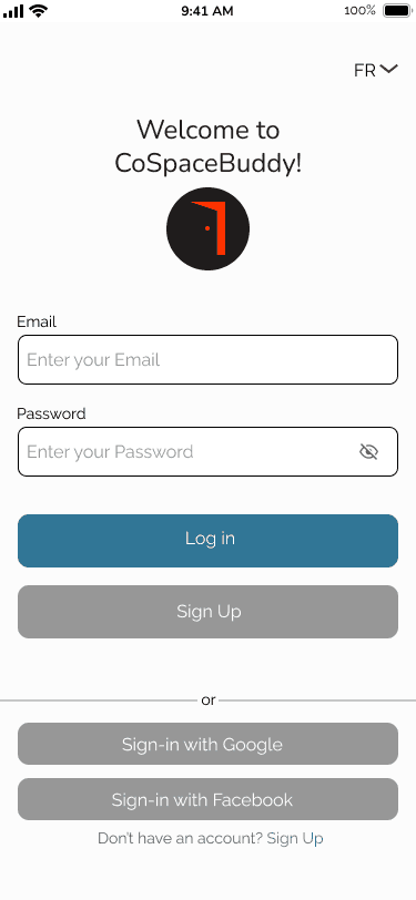
Consistency
I removed the unnecessary "Welcome" message and replaced it with text explaining the app's function. I also centralized important information, focusing on user ergonomics and habits.
Additionally, I adjusted the button options and layout to better meet user needs.
Icons
I standardized the line thickness and removed distracting elements like shadows and progress bars. I also unified the appearance of buttons for a more organized look.
The consistent placement of elements and their proportions make it easier for users to orient themselves on the site.
Facilitation
I added a search bar to expedite language selection and grayed out the white background for better readability.
Following industry standards, I relied on established user habits for naming and placing key elements, such as radio buttons that allow selecting only one option.
Transparency
The addition of light gray balances the white space, creating a harmonious and tranquil feel. This subtle treatment makes the screen even more pleasing to the eyes without sacrificing aesthetics and readability.
In the previous version of the screen, there is no option to return to the previous screen, so I have added a back button to improve navigation.
Layout
Longer texts in two columns are often problematic on small devices.
With a single-column layout, users can give longer titles to their services and find it easier to focus their eyes when viewing information.
Hierarchy
Changing the hierarchy of information and adding labels helps users to scan lists quickly. Zooming in on a photo allows for better presentation, and the colours chosen have the right contrast (re: WCAG 2.2).
I have also relocated the ‘Send message’ button, changing its style while clearly indicating a lower position in relation to the main action.
Content
The careful composition of the grid intuitively directs the user's attention to key elements.
Both icons, graphics and images are kept in similar tones, thus maintaining uniformity and visual consistency.
Consistency
I removed the unnecessary "Welcome" message and replaced it with text explaining the app's function. I also centralized important information, focusing on user ergonomics and habits.
Additionally, I adjusted the button options and layout to better meet user needs.
Icons
I standardized the line thickness and removed distracting elements like shadows and progress bars. I also unified the appearance of buttons for a more organized look.
The consistent placement of elements and their proportions make it easier for users to orient themselves on the site.
Facilitation
I added a search bar to expedite language selection and grayed out the white background for better readability.
Following industry standards, I relied on established user habits for naming and placing key elements, such as radio buttons that allow selecting only one option.
Transparency
The addition of light gray balances the white space, creating a harmonious and tranquil feel. This subtle treatment makes the screen even more pleasing to the eyes without sacrificing aesthetics and readability.
In the previous version of the screen, there is no option to return to the previous screen, so I have added a back button to improve navigation.
Hierarchy
Changing the hierarchy of information and adding labels helps users to scan lists quickly. Zooming in on a photo allows for better presentation, and the colours chosen have the right contrast (re: WCAG 2.2).
I have also relocated the ‘Send message’ button, changing its style while clearly indicating a lower position in relation to the main action.
Layout
Longer texts in two columns are often problematic on small devices. `
With a single-column layout, users can give longer titles to their services and find it easier to focus their eyes when viewing information.Content
The careful composition of the grid intuitively directs the user's attention to key elements.
Both icons, graphics and images are kept in similar tones, thus maintaining uniformity and visual consistency.
Icons
I standardized the line thickness and removed distracting elements like shadows and progress bars. I also unified the appearance of buttons for a more organized look.
The consistent placement of elements and their proportions make it easier for users to orient themselves on the site.
Transparency
The addition of light gray balances the white space, creating a harmonious and tranquil feel. This subtle treatment makes the screen even more pleasing to the eyes without sacrificing aesthetics and readability.
In the previous version of the screen, there is no option to return to the previous screen, so I have added a back button to improve navigation.